Visual Diagram Artwork Process
I began with drawing out and brightly painting my title design, using current and striking typefaces as references to add interest and set the scene for the poster.
I drew out and cut my mobile phone design, taking care to use the whole space of my A2 medium. From this point onwards I was able to split the screen of the mobile phone up into its broken shards, so that I new how much space to work with for each area/task/piece of informative illustration to be completed and began to paint.
 |
| Creating masks to stick over areas I didn't want to paint. No masking fluid solution |
 |
| Edge of phone texturised (as if dirty and scratched) |
 |
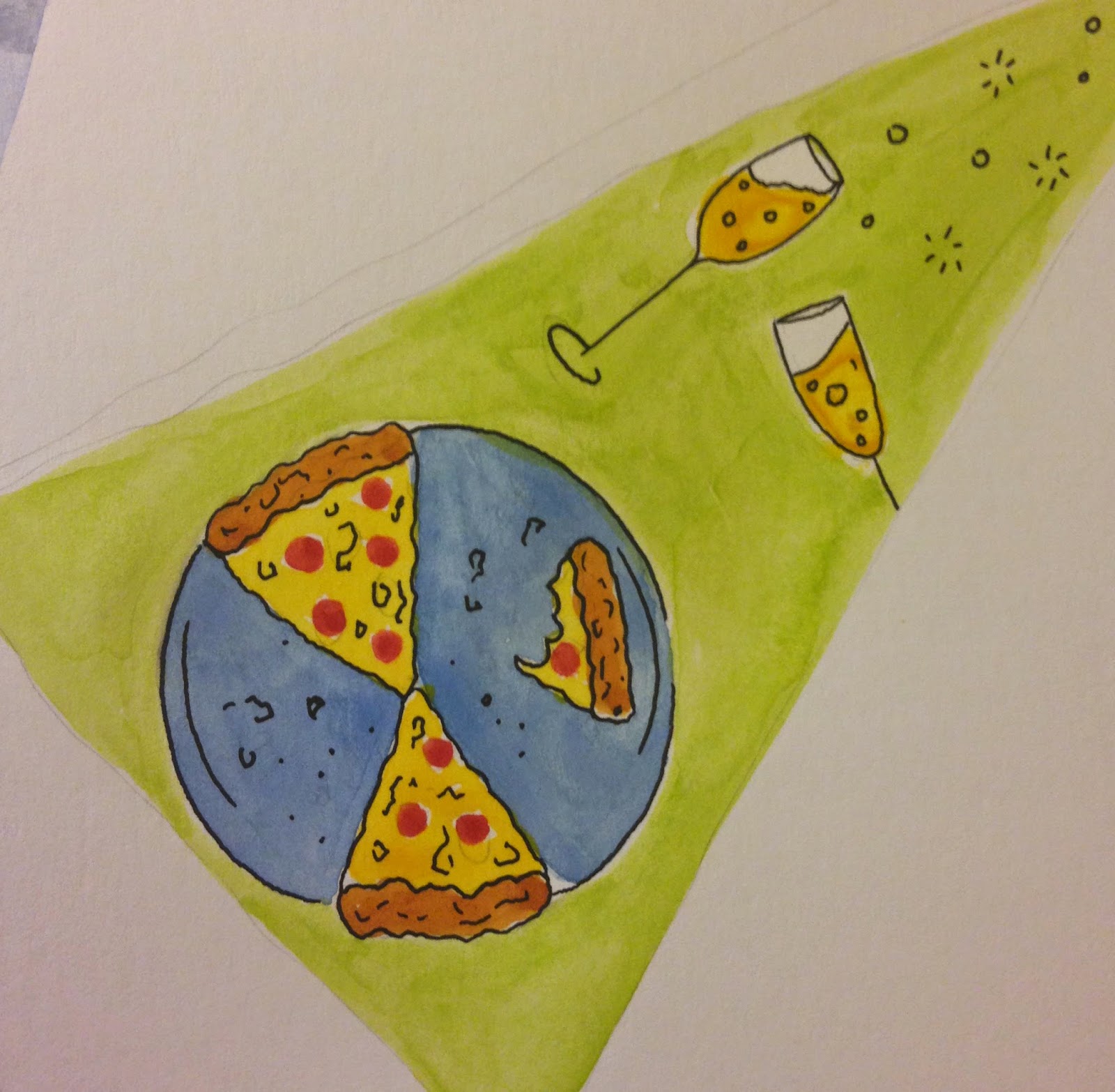
| Take up a new hobby (instead of spending time on social media) |
 |
| Feed your brain |
 |
| Learn something new (instead of staying with ones comfort zones) |
 |
| Visit a friend in person (not just whatsapp them) |
 |
| Take regular breaks |
 |
| Learn your surroundings (so as to not require the map app on smartphones) |
 |
| Be active (instead of relying on health and fitness apps) |
 |
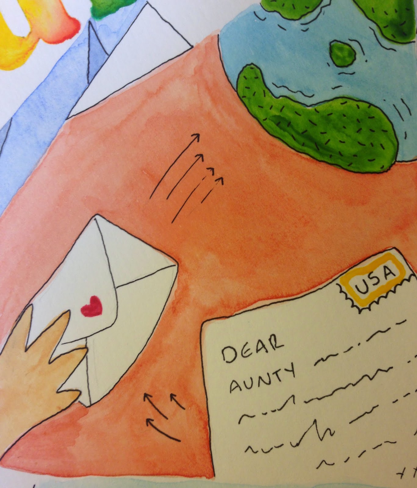
| Send a letter to a loved one, instead of a text |
 |
| Sleep well and be well rested. Switch off smartphone |
 |
| Relax and indulge in interests |
 |
| Be physically organised |
 |
| Go for walks, get outside and see the world instead of looking into a screen |
 |
| Be punctual, invest in an alarm clock instead of needing mobile phone to do it |
 |
| Paintng the individual sections |
 |
| Final design |
Digital Editing
After completing my painting, I was able to use the brilliant A2 scanner in the digital print resource and edit my final poster in photoshop.
 |
| Adjusting levels |
 |
| Adding relevant text. Small, so as to not overwhelm illustrations |
 |
| Tidying up splashes and spillage's using the patch repair tool |
Successes
Overall I am really pleased with the concept for my poster. I wanted to convey that even though many of us feel anxious if our mobile phone is broken, lost, stolen etc (or even when it isn't), there are many things to do - things we should do - to stay mindful and get the most out of life for ourselves in the present and for others around us. Using watercolour (despite being a major challenge) helps to reiterate the anti-digital message I am trying to put forward here - giving a more painterly result, in contrast to digital forms of media which people are used to seeing everyday.
I am pleased with the amount of colour I have been able to input into the poster - helping to reflect the positive nature of its message and hopefully standing out as vibrant and aesthetically pleasing visual diagram to look at.
Failures
Watercolour as the media choice for my poster was a brand new experience for me and one I am not sure paid off. I put so much effort into this poster - painting for days due to the size and scale- and the messy result doesn't necessarily convey this. I also think that the information and impact of the poster would have been a lot clearer and more bold if I had chosen to use digital media (despite this going against the "anti-digital" message of the poster).
I would have also like to have include more information in my poster. This is predominantly a positive "self help" visual, however I think relating some of the visuals back to some of the facts about smartphone addiction, usage and nomophobia within society would have helped this diagram be more informative.


